Your businesses contact page is one of the most important pages your website can offer to customers.
The contact page serves as a direct channel between customers and businesses to give feedback.
While the contact page may not be the first thing you notice on a website, it’s one of the best ways to communicate with your customers.
Website contact pages can include contact forms, maps, tutorial videos, social media links, and so much more.
We went ahead and made a list of our favorite websites with the best contact pages to help you build your own. Hope you enjoy!
Our Contact Form Best Practices
Of the examples we analyzed most contact pages had the following characteristics:
- An email address and phone number that visitors can easily find
- Outlines why users should contact them.
- The page helps solve their customer’s issues by providing relevant information.
- The page is easy to find on the website menu or directory.
- Includes a short form that asks for contact information for follow ups.
- Contains a call to action button that offers visitors an alternate option if they don’t want to complete the first form.
- Links to a recent blog post or forum about the company where more information can be found.
- Includes links to the company’s social media accounts (Twitter, Facebook, Instagram and LinkedIn).
- Includes a redirect to a Thank You Page after the user fills out the contact form.
- Straightforward language and messaging that is universally understood by visitors.
Examples of Great Contact Pages
Contact pages that enhance user experience can strengthen relationships between you and your customers.
While every business and buyer experience is unique in its own way, there are many elements we found that you can utilize and include in your own business contact page.
Here are some of our favorite contact pages.
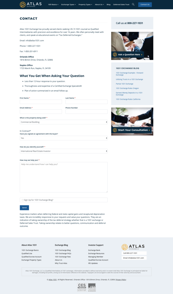
Atlas 1031 Exchange takes a simple but sleek approach to their contact page.
Their webpage includes (1) a clear time frame you can expect them to answer your question, (2) a certified guarantee that a qualified Exchange Specialist® will review your questions, and (3) a guaranteed follow-up email that summarizes the issue and offers their insight to your problem.
One thing to note when creating a contact form like this is to make sure you identify what information you require from the customer in order to process their support ticket.
These required fields are often denoted using a star icon (*) or some other symbol that is easily recognized when filling out the questionnaire.
Other great aspects this page offers are the easy-to-follow contact information and contact forms, buttons for social media platforms, recent blog posts by the brand, and other links to relevant offers.
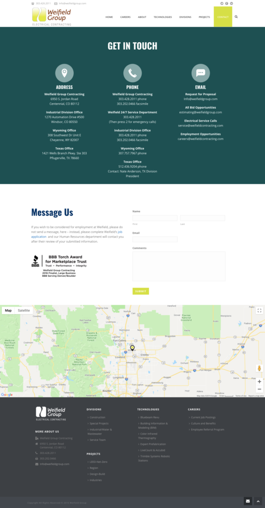
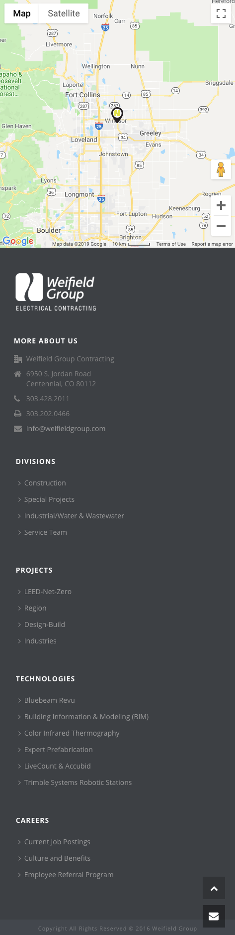
Weifield Contracting does a great job of showcasing a responsive and sleek contact page design. One thing to note here is the responsiveness of their page for different platforms like mobile phones.
Mobile phone web browsing has continued to rise every year as smartphones become faster and more powerful. This means that sites like Google, Bing, Firefox and more will favor websites that provide an easy-to-use experience for customers browsing the web.
More specifically, Google heavily favors websites that are mobile-friendly on the search engine’s results pages.
Examples of Mobile-Friendly Features
- Simplified navigation (menus and buttons are easy to click on).
- Shorter contact forms.
- Easier to click call-to-action CTA buttons.
- Larger form fields that are easy for people to fill out on their phones.
- Responsive images that adapt to screen size.
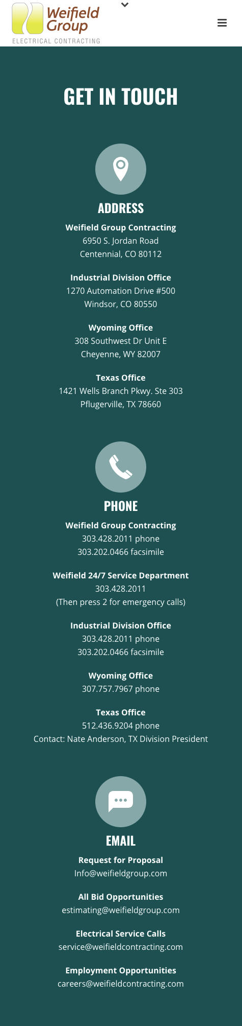
Contact Page Mobile View Example
How does the Weifield Contracting Group mobile view differ from its desktop view? See for yourself.
Straightforward address, phone, and email information for customers to use for contact purposes.
The lettering is also presented in an easy-to-read font for both desktop and mobile viewers.
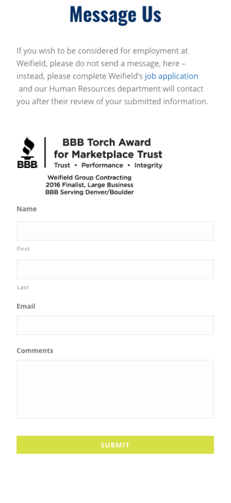
A messaging contact form for customers who want to report their problems and receive feedback at a later time. Note that they only ask for the customer’s name, email, and comment about the issue they are experiencing.
Asking for too much information can leave a bad impression in certain instances for the customer.
And a map for users to see where their office is located as well as other relevant information about the company.
Be sure to update your companies contact information on Google My Business so your business is accurately displayed on any map API’s you use on your website.
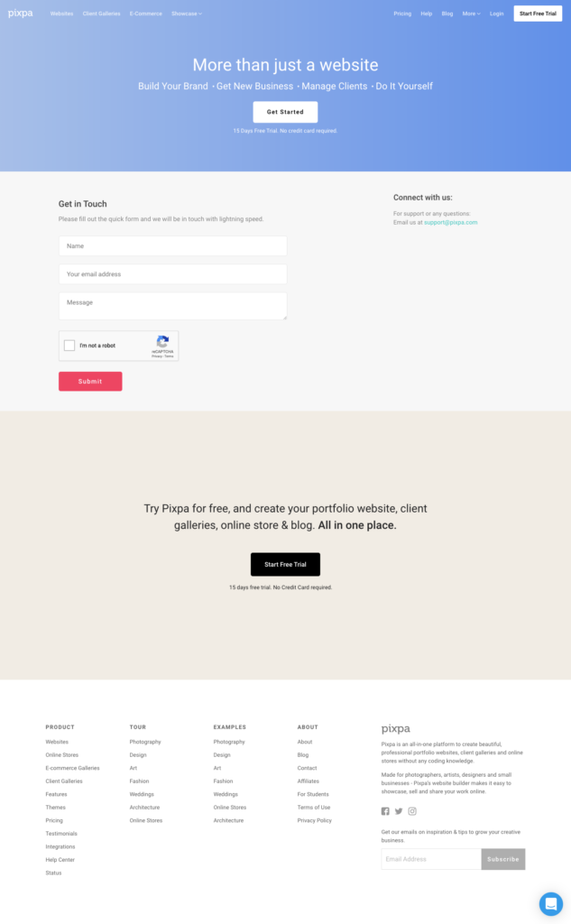
Calls to action are something we all wish to see on websites, but surprisingly many websites don’t include them.
Pixpa chose to include their CTA as a free trial button on their contact page to convince people to demo their product.
Offering free trial access to a product or service to consumers is a great way to boost conversion rates and customer retention.
As a business you need to think about customer experience on your website; especially when informing new prospects who are just starting the customer journey.
For folks who don’t want to fill out a contact form, a secondary call-to-action button gives your customers an alternative contact resource.
Sometimes short and sweet is the best way to go when creating your landing page.
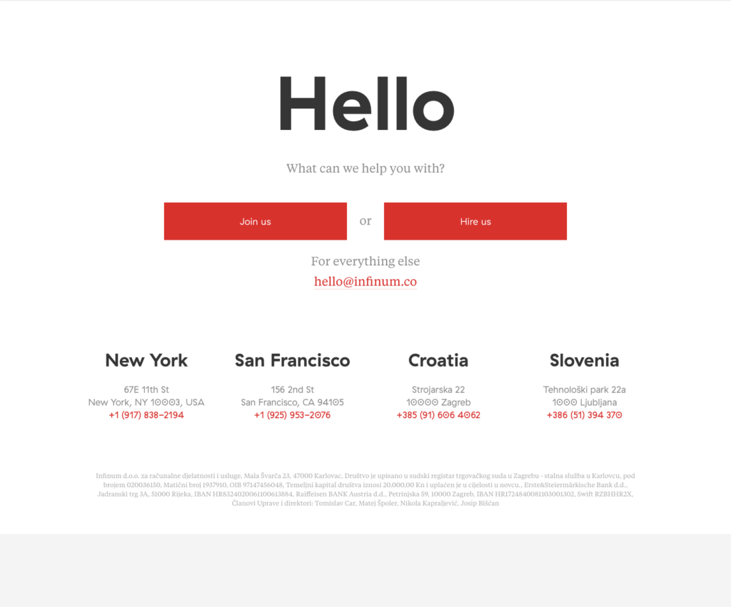
Infinum has a lot of strong elements featured on their website page, specifically the use of CTAs and proper questioning for new & existing customers.
Note the order of the way they phrase their questions and CTAs.
Your customers expect you to be able to answer their wants and needs, oftentimes during times where things aren’t going according to plan.
Reassurance goes a long way, and anyway you can provide useful feedback or information to your customers will make them trust you even more.
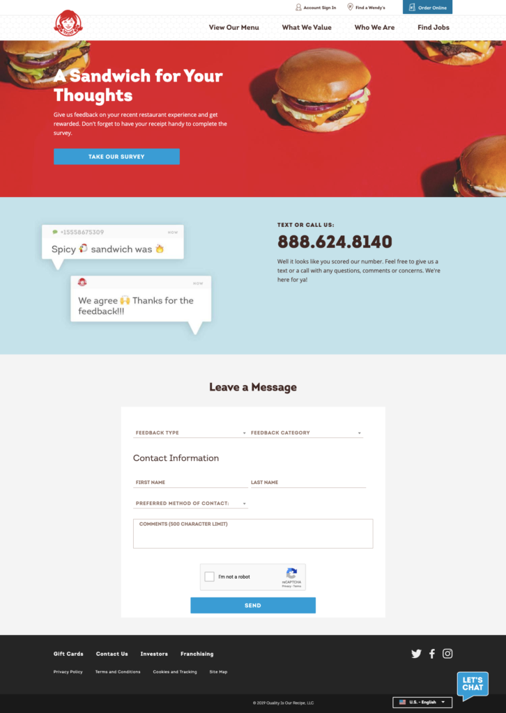
Yes, even Wendy’s has a contact page on their website, and it’s great like their burgers. Wendy’s as a brand has thrived using their social media platform as a way to interact with customers in new and unique ways.
Wendy’s adds texting as an alternative contact form to give feedback about new deals or meals they are releasing.
This creates a personal interaction between the brand and its customers that is memorable, and most importantly, repeatable.
They also include a contact form as a secondary way customers can leave more formal inquiries which is a nice touch.
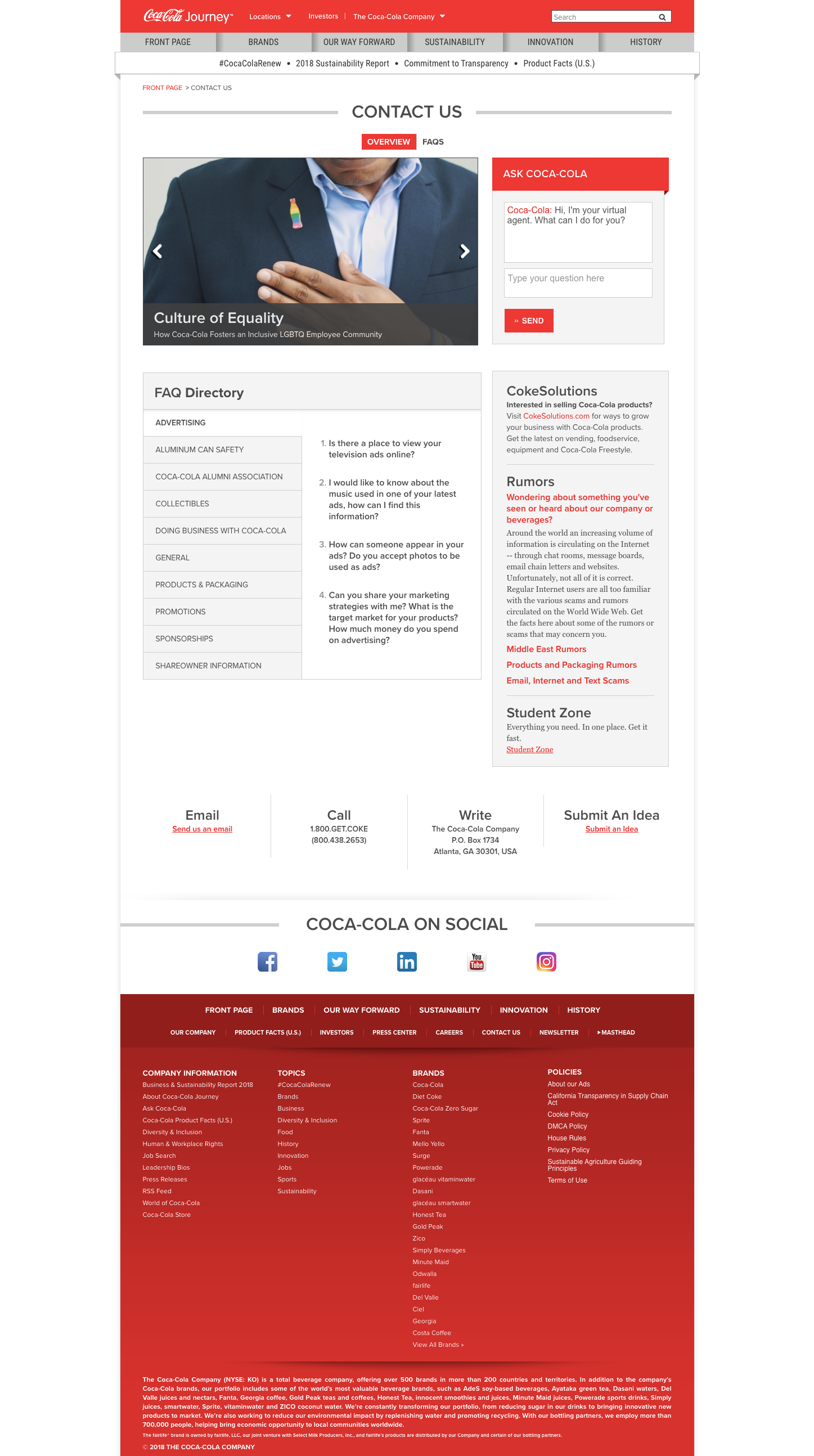
The brand known around the world takes a more in-depth approach to the contact page formula.
What makes Coca-Cola’s contact page interesting is its FAQ directory, CokeSolutions, and Ask Coca-Cola section.
These three areas include a bevy of information about reselling, advertising, repackaging, sponsoring and more about the Coca-Cola product.
One thing that we found interesting was the Coca-Cola rumors tab in the CokeSolutions section.
Coca-Cola uses its contact page as a way to inform their customers about upcoming products, as well as dispel rumors about products that aren’t true.
You can also use this kind of messaging on your website if you find information about your business on the web isn’t correct.
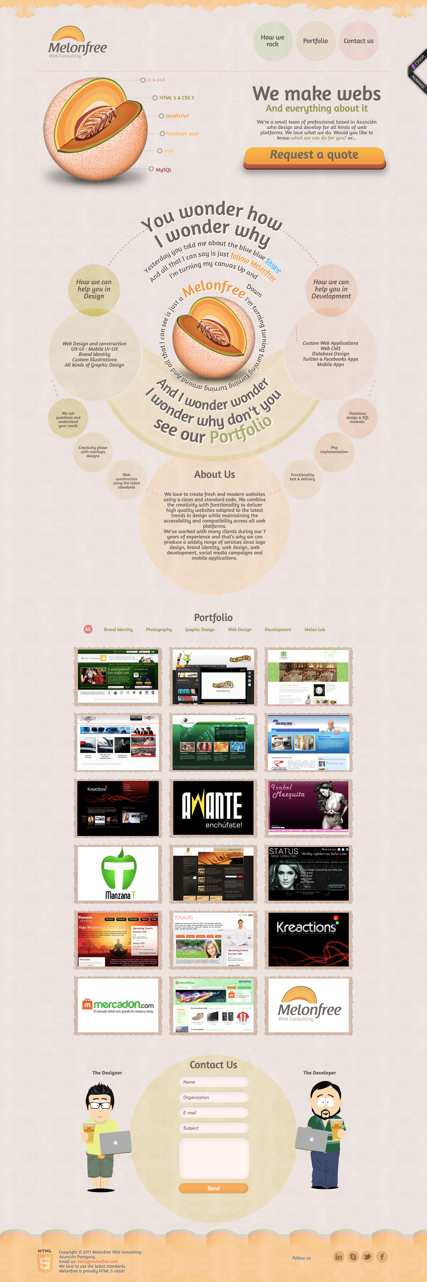
MelonFree brings a unique flair to their contact page through memorable design artistry. You want to prove why your business is different from the competition, and one way to do this is to take pride in the smaller details of your product.
In the case of MelonFree, they design websites for different brands from all types of industries.
Showcasing their creativity and willingness to innovate the website-building industry makes them an attractive brand to contact.
As a bonus any fan of SouthPark will recognize the art style they used for their contact form.
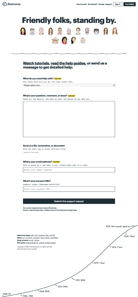
Putting a face to a brand can be a challenging goal when interacting online with customers. We love the way Basecamp styled their webpage by including personalized features about their team.
One interesting addition is the ability to attach a screenshot or image as a part of the contact form so both sides can illustrate what the other sees.
Basecamp also includes a detailed list of all the platforms they integrate with (iOS, web, Android, Mac, and PC) as well as other resources such as podcasts, blogs, and relevant contact information.
The graph showing how many accounts signed up is nice as well, as it creates a visual for the success they are experiencing as a company.
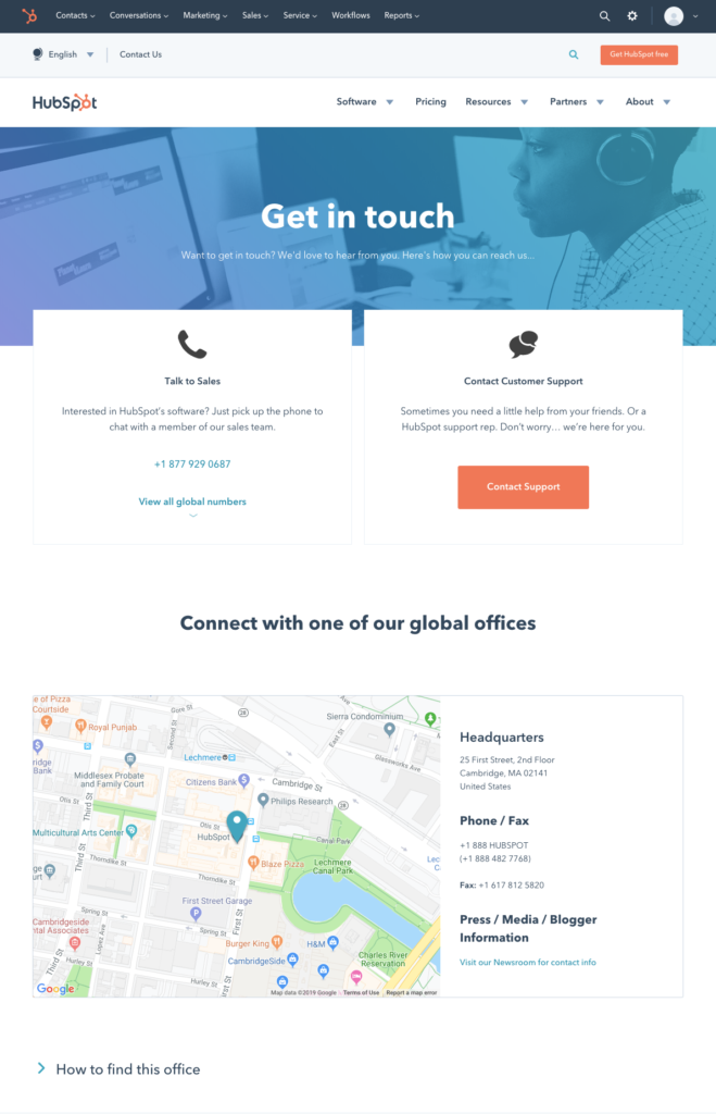
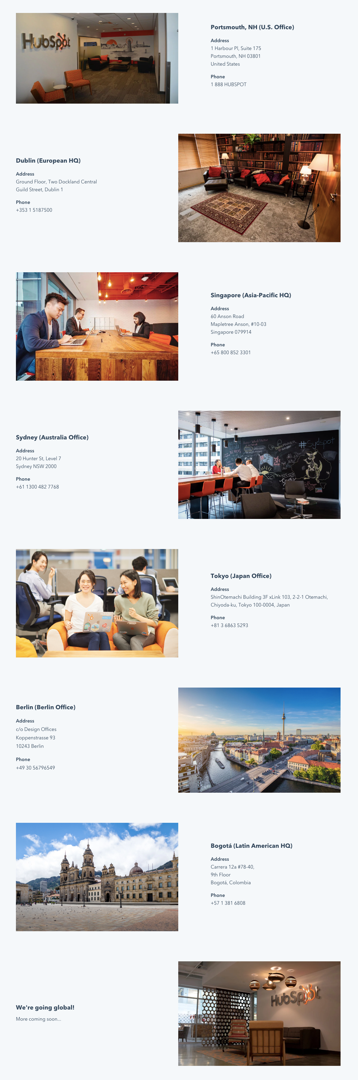
As one of the leading CRM’s in the industry, it’s no surprise Hubspot has a great contact page. Hubspot builds off of other successful contact pages by including:
- A map API for customers to find them.
- A Clear CTA button for contacting support.
- Pictures for each office location to show the differences between sites.
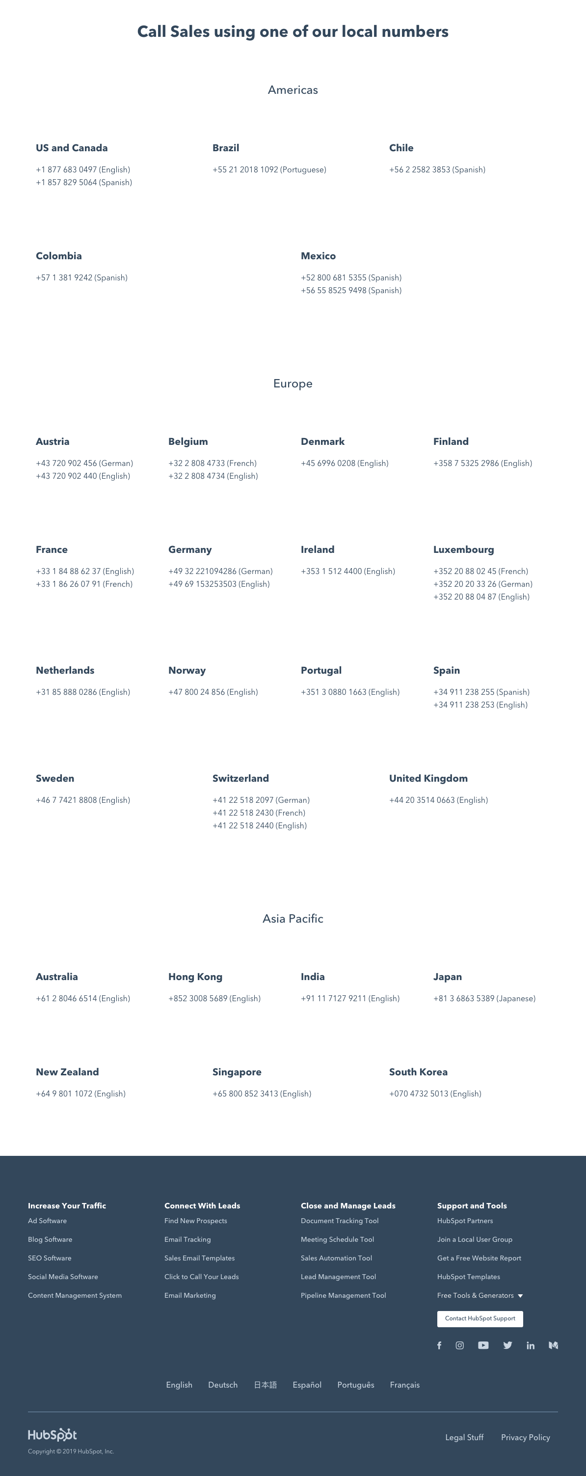
- All the relevant sales numbers for every region they do business in.
Another aspect we want to highlight is Hubspot’s use of resources to enhance customer experience on their website.
A knowledgebase is a tool that your business can use to inform people about how your product works. As you build out your product, you can update the knowledge base so people can track all the new features being released.
It’s a great project your customer success team can create to enhance your business.
Hubspot includes a ton of resources for any issues you might encounter while using their product.
As you can see here, Hubspot personalizes all their different offices by including pictures of the workspaces. This gives the brand a sense of identity and allows customers to imagine real people are working at the company to help them with their problems.
If you are a global company, including region-specific sales numbers is a great way to tell customers where to contact you based on the region they are in.
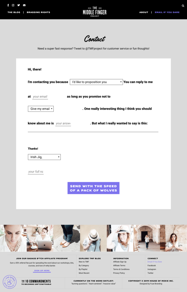
Our honorable mention for unique contact pages is The Middle Finger Project for their unique approach to contact forms. The Middle Finger Project is a blogging website that takes personalization to the extreme but in a totally on-brand way.
Site-founder Ash uses a mad-libs approach to contacting her by allowing users to fill in multiple options in the contact form provided.
For a blogger personality means everything, so when you can create a unique and interactive experience for your followers you build loyalty towards your brand and as a go-to source for information.
Conclusion
Building a great contact page for your business will help your customers and potential clients find relevant information about your business.
For more ways to boost customer success check out our recent article on customer success programs for your business.
 9 min read